Nussknacker
Color Palette Optimization
UI Improvement
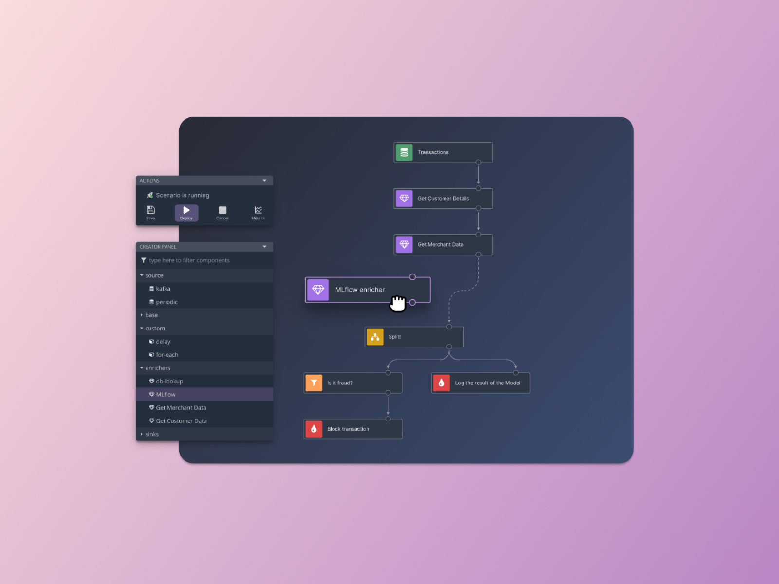
Forms in the Nussknacker application play an important role in the user's interaction with the system. Their length and structure cause difficulties for the user.
User feedback analysis confirmed issues with clarity and difficulty in data navigation. Inconsistent information grouping hindered context comprehension and effective data entry.
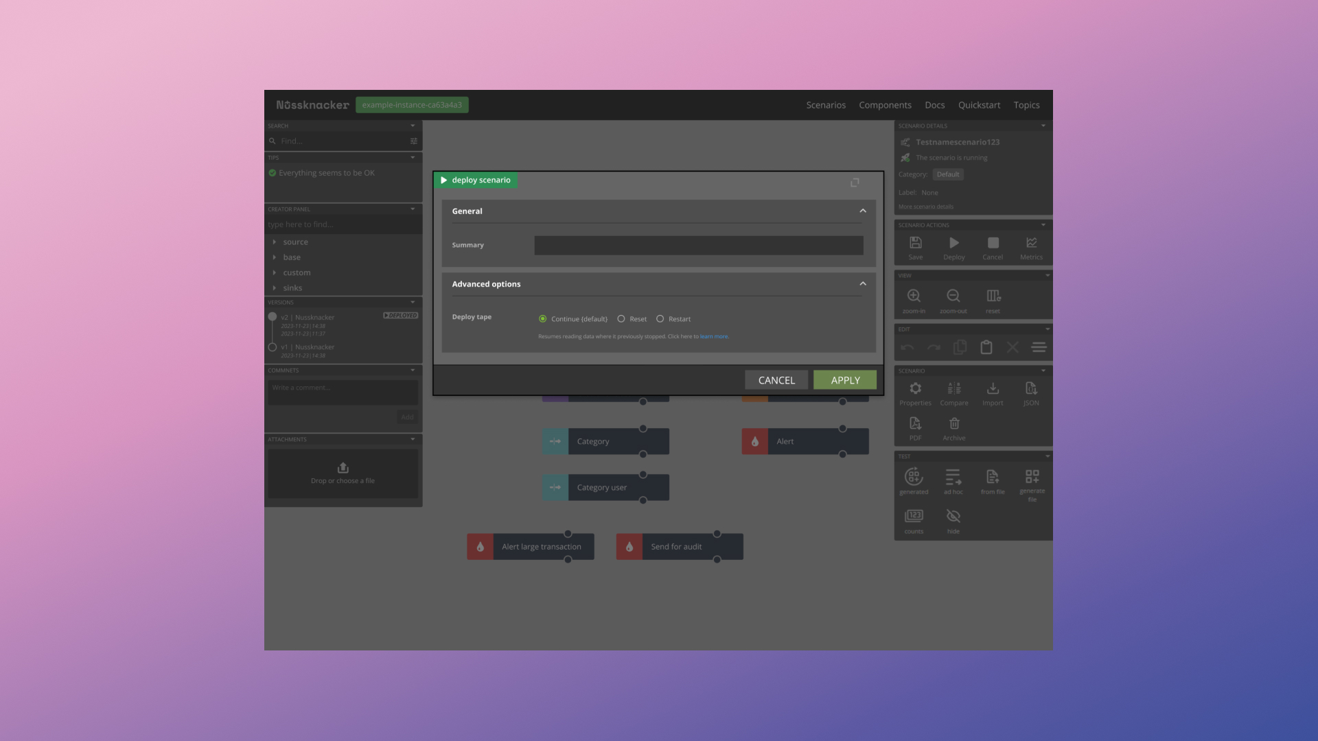
To enhance the User Experience of forms, a comprehensive redesign was undertaken, focusing on:
Implementing a two-column layout within a modal as a key structural change.
Dividing the form into two zones: the left column for data editing, focused on active data entry, and the right column for contextual and general information about a given node, including name, type, documentation link, input/output. This division aims to reduce user cognitive load and facilitate data context understanding.
Applying modern inputs from the Material UI library, improving the aesthetics and readability of forms. Adapting the color scheme to the dark mode previously implemented in the application, ensuring visual consistency and ergonomics.
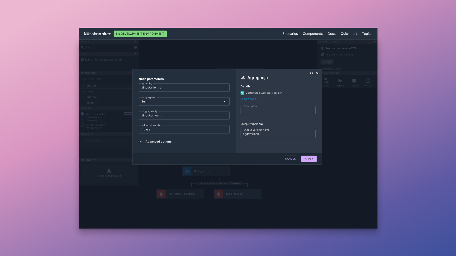
Applying modern inputs from the Material UI library, improving the aesthetics and readability of forms. Adapting the color scheme to the dark mode previously implemented in the application, ensuring visual consistency and ergonomics.