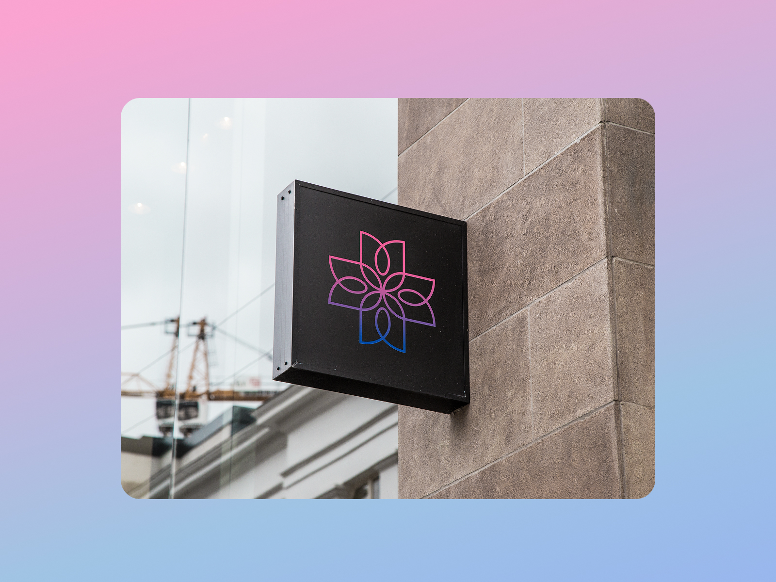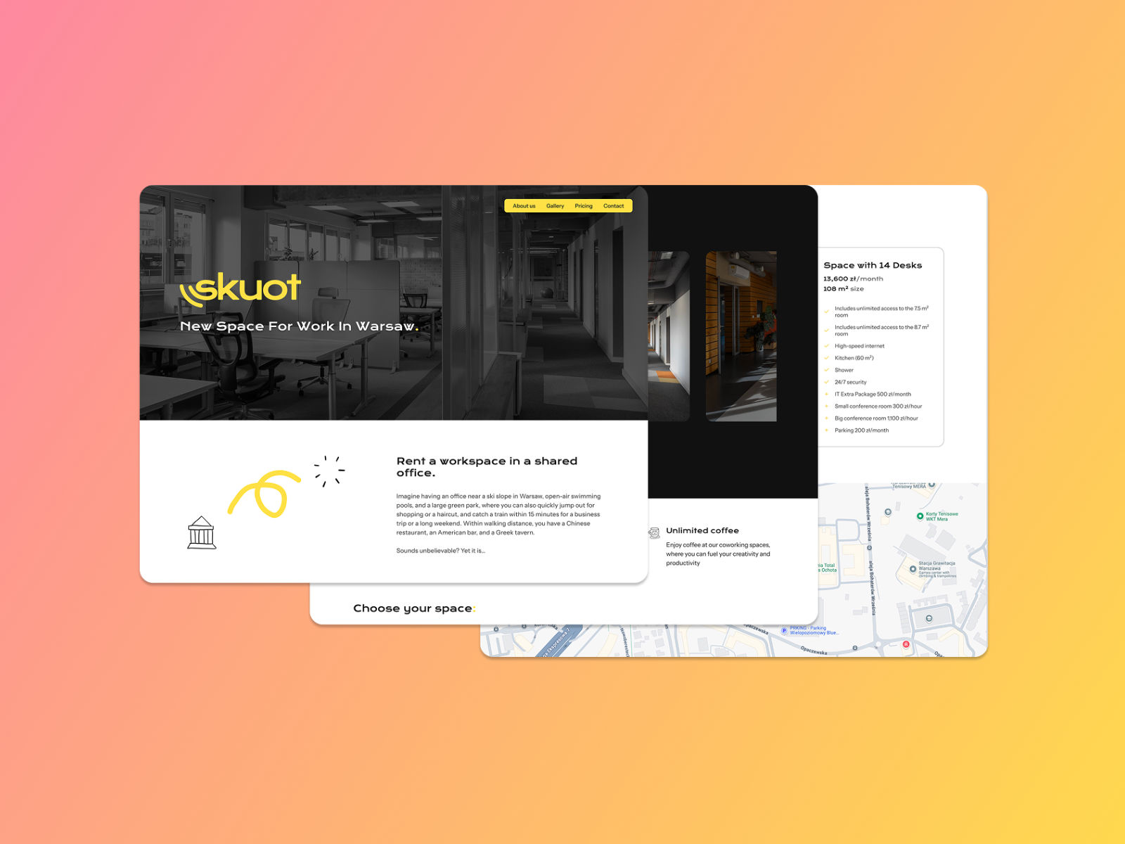
Skuot
Branding & Website Design
Color Pallete Optimization
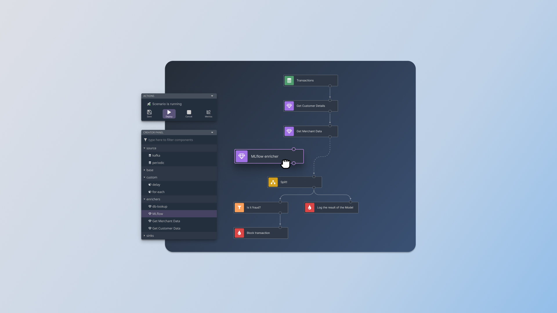
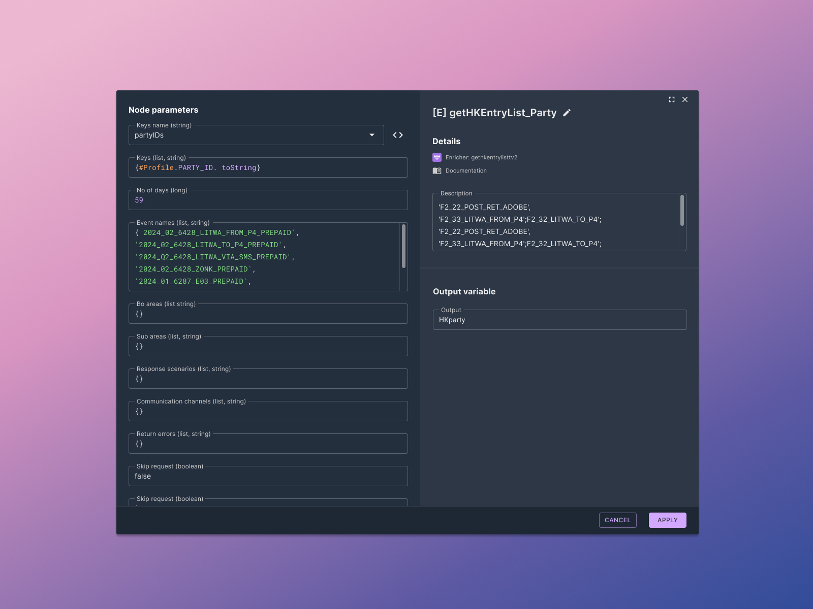
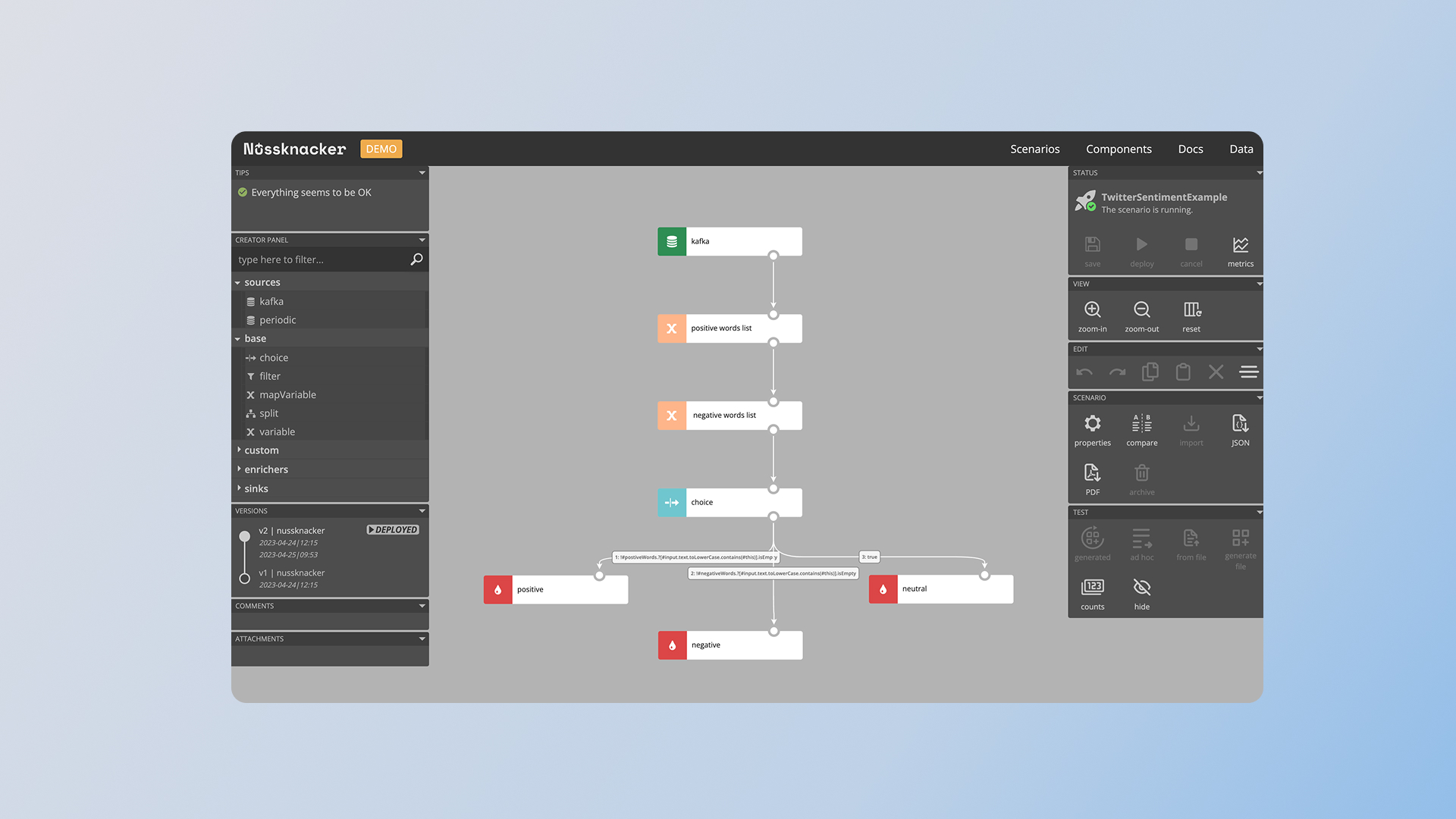
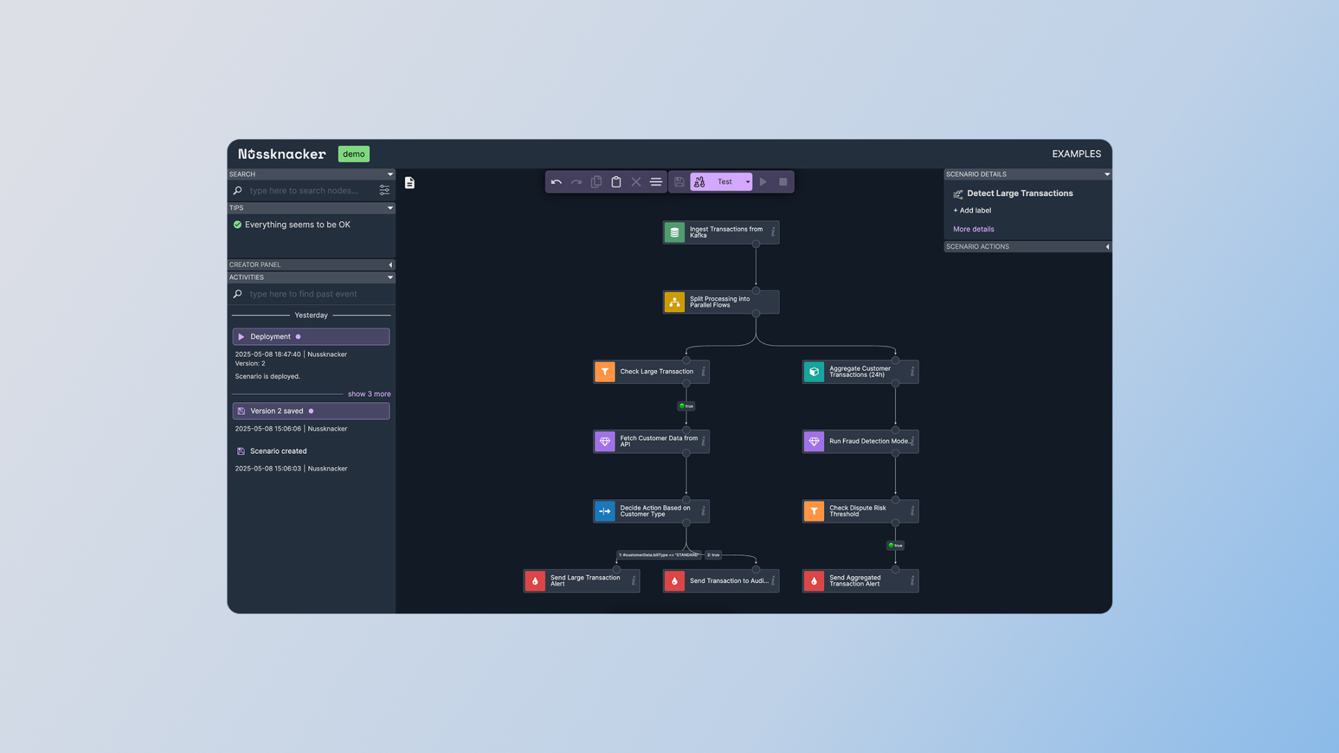
Nussknacker is an advanced yet user-friendly low-code tool that empowers businesses to intelligently process real-time data. This enables them to react faster to changes, automate processes, and make better business decisions.
Visit websiteThe Nussnacker web application faced accessibility and readability issues stemming from insufficient color contrast in the interface (below WCAG 2.2 standards). User feedback confirmed eye strain and discomfort caused by the current color scheme. Additionally, the absence of the brand color in the application weakened its visual consistency with the brand ecosystem.
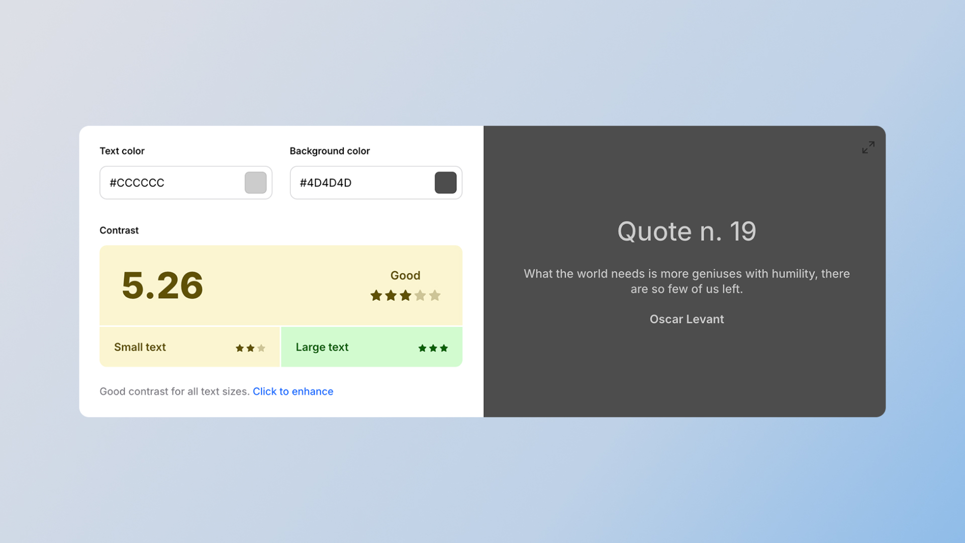
I conducted a comprehensive color accessibility audit of the application, also analyzing user feedback to identify areas requiring enhancement. A key step was optimizing the color palette by reducing the number of shades, which increased visual coherence. The new palette was meticulously crafted in accordance with WCAG 2.2 and MUI Material UI guidelines, with an emphasis on maximizing contrast and readability. The existing dark theme was expanded to a full dark mode, valued by developers, and the brand color was strategically integrated while maintaining high contrast. The entire process was iterative, based on close collaboration with the team and client, and on regularly gathered user feedback.
Performed a comprehensive color accessibility audit of the application to pinpoint areas needing enhancement. User feedback was gathered and analyzed.
To enhance visual coherence and streamline the design, a decision was made to reduce the number of colors within the application, eliminating redundant shades. The redesigned color palette was meticulously crafted, adhering to WCAG 2.2 and MUI Material UI guidelines, with a primary focus on maximizing contrast and readability.
Continuing the application's dark color scheme, we expanded it to include a complete dark mode, valued by developers for its enhanced working comfort and reduced eye strain.
This project was driven by close collaboration with the team and client, ensuring alignment and shared understanding. User feedback was systematically gathered and leveraged to iteratively refine the color palette.
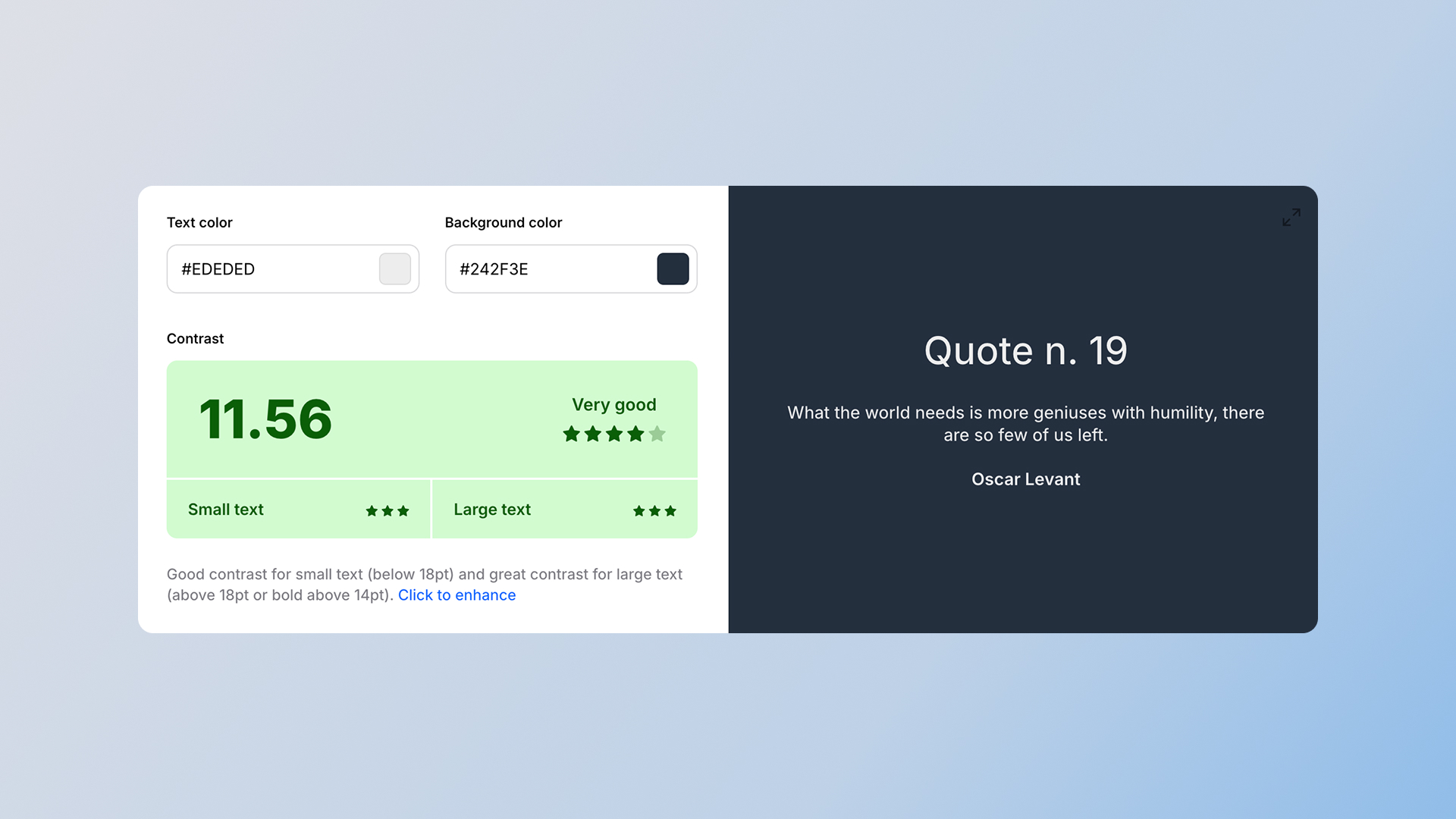
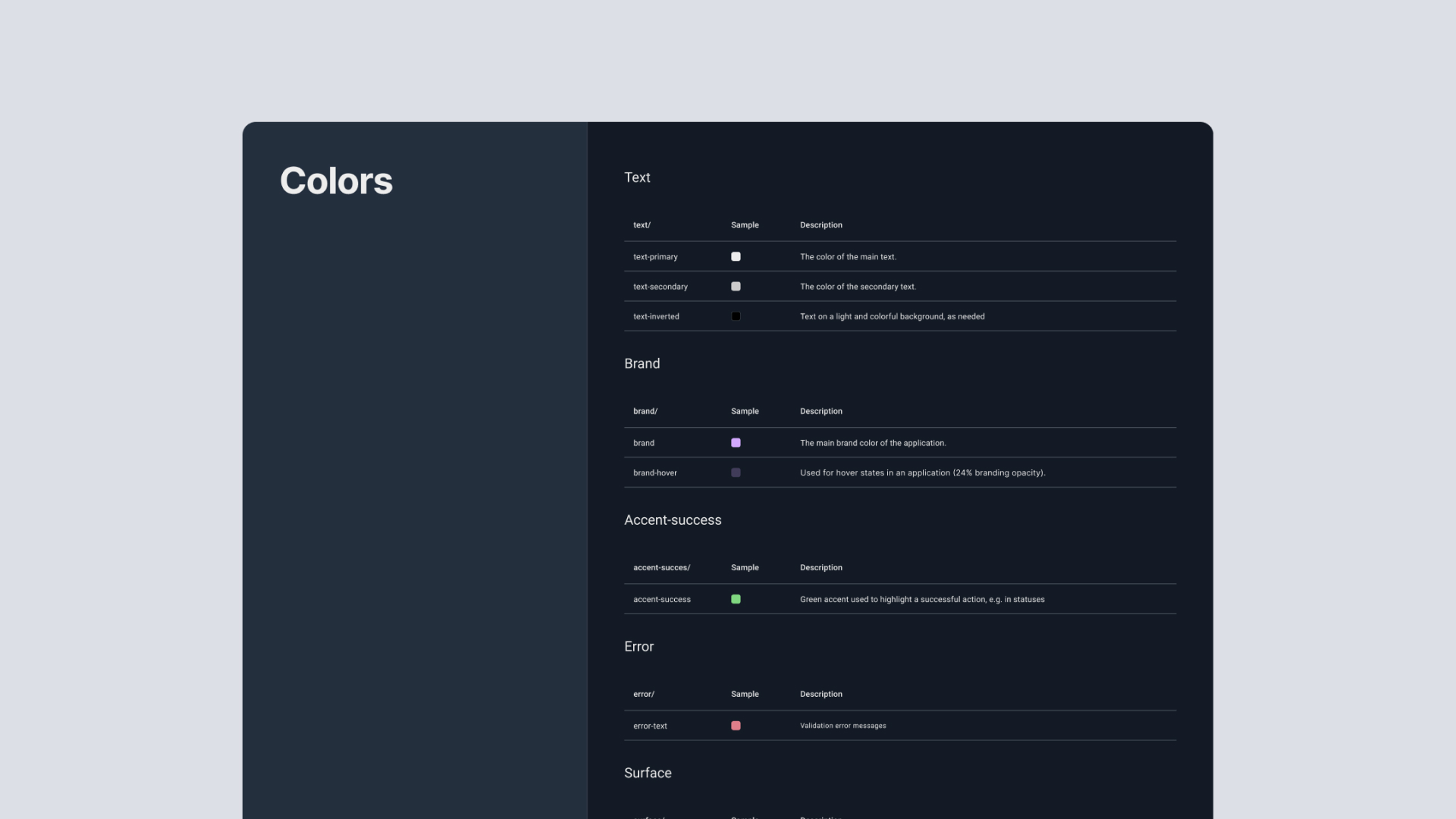
The new color scheme meets WCAG 2.2 standards, making the application more inclusive and accessible to all users, including those with visual impairments.
User feedback confirmed enhanced readability and reduced eye strain, resulting in an improved User Experience.
Figma documentation precisely defines the new color palette and its usage guidelines, facilitating implementation and ensuring future consistency.